As a POD seller you probably have some clever designs. Well, I do. You have a smart idea, an idea that is funny, intelligent and you’re convinced it’s a sure sell. A design on which you spend way too much time and energy. I’ve made them too and I must say, the sales are often below expectations. Let me show some of my duds.
No Harry Potter Magic
I do like the design language of the Harry Potter movies. Minalima studio I admire and I’ve got a couple of books from them. Therefore, now and then I dabble with recreating some HP design element. The Ministry of Magic logo looked cool and and a remade it in a vector. So, why not try sell it on Zazzle? Without any references to Harry Potter of course. That would be copyright infringement. I did two experiments, one with a business card and one with a postcard with real gold foil.
The postcard with gold foil looks particularly well executed. If this doesn’t appeal to you inner niffler!
For the business card I got at least a couple of views. On the other had the postcard has to date zero views. I did enjoy creating the logo though.
Nothing else matters
My barber often sports a T-shirt with the text “Nothing” on the front an a big zero on his back. Both text in the typical college varsity style. I thought it very funny and worthy of reproducing. To be fair, I think it’s actually from a brand, but the idea is so generic. To make sure, I made some alterations that to me looked better than the original.
Well executed, but it didn’t matter. This is you typical text design that, if well made, usually does good in views and sales. Fortunately I didn’t spend as much time on this design as the Ministry of Magic logo.
Everybody knows what a Triskelion is
I made a series of Islamic geometric designs. You the tile patterns you see a lot in Arabic countries. One got my attention, a variation on those three legged or armed ( see the flag of the Isle of Man ). This is also called a triskelion. I accepted the challenge, got the tiling just right and picked the right colors. You could say I was pretty proud of design. Pretty clever, not something you can find somewhere else, won’t you say?
These Islamic geometric designs are tricky to make and time consuming. Only now and then I make one of these. Though very pleased with myself, I must confess disappointed with the lack of sales of my triskelion. Maybe most people don’t know what a triskelion is.
Clever design and lesson learned
Well, I learned my lesson, but somehow I keep forgetting it. “Don’t start with an intrinsic or clever design which you find cool, but really doesn’t have an audience outside yourself”. Obviously I just couldn’t help myself.
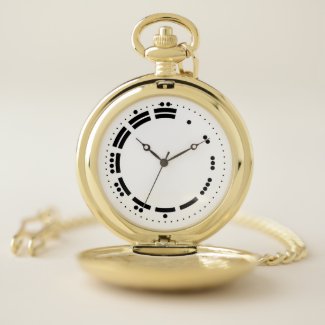
Zazzle has a range of clocks and watches. Which I never used before because a clock or watch face needs a too specific design. Those do not scale to other products. Until I saw the way the old Mayans use counting numerals. What if I used these numerals for a watch face?
It’s a pretty fresh design and I think it’s particularly well executed. It was fun to create, but the image is only fit for clock and watch faces. Because of this only some other print-on-demand platforms sell a couple of clock types, and that’s about it.
Clever designs, be it funny or intelligent, usually only tickles your intellect. If you don’t have a good feeling that there is an audience for your creation, most likely you won’t get any sales. Nevertheless don’t stop making a clever design, it is fun and it keeps you motivated to continue with print-on-demand. Which, to be honest can be a grind.


